Opinions about the Australian property market, served every day so generously in the media, are rather difficult to reconcile with the reality. Even the experts cannot make any sense of property prices continuing to rise stubbornly to new heights “despite all odds”. Everyone wonders when it will end and how badly…
In this three-part series I would like to share a few of my favourite statistical indications that help explain, surprisingly accurately, what is happening in the Australian property market. There will be references specifically to the ACT as well, but first, let’s deal with some facts to put what follows into proper context.
One of the main causes of confusion about the property market is that the media loves chasing extreme views and celebrity commentators (who mostly either have a hidden agenda to push or are charmingly opinionated but blissfully uninformed on the subject).
In depth analysis of issues is a tedious task. It takes a lot of effort to conduct these thoroughly so it is much easier to reach for the “ready-made opinions”. Therefore, what propagates are essentially self-perpetuating myths.
As a result, you hear every year in May that “we have reached the peak” and that the end is nigh. Or that Australia has a “housing affordability crisis” (a situation that is strangely persisting for a second decade in a row now – but don’t let this fact spoil a good headline).
Or that “prices are not sustainable since there is ‘no growth’ in wages” – but let’s conveniently disregard the fact that even 2% annual growth in average wages allows borrowing an extra $20-25,000 each year with very little or no negative impact on family finances. After a few years the capacity to borrow can grow to quite a number!
Then there are claims that prices “will fall soon and by at least 40%”. It is only explained in the fine print that this ‘may happen’ sometime in the next decade or so.
Not to mention continuous blaming of foreigners and property investors for “paying over the odds for properties” and in the process “mindlessly blowing the property bubble”. However, there is a total disregard for the elephant in the room – that is, the effects low interest rates and cash loaded upgraders have on the market.
In this environment it is very rare that a balanced opinion filters through to a wider audience. Not for lack of trying though – no major media outlet, independent or commercial, is prepared to touch “this stuff”. It is simply considered too controversial for their audiences. The truth is that it is better for media business to serve what the public likes to hear, and not what properly explains the reality.
I, for example, went on record in early 2014 sharing the results of my analysis on property prices in Australia and market outlook for the following decade but it did not generate any interest from the mainstream media. Not even as a counter argument to otherwise one-sided ‘debates’ on the property related issues. What happened to journalistic creed of presenting objectively all sides of the story?
Yet, three and a half years later, my mid-range growth scenario is proving quite accurate while the then media-favoured property market doom scenario failed to materialise – mind you, doom sold so well at the time…
There was a real, tangible value in that analysis so, from time to time, I revisit bits and pieces of the original information for the public good. This is another such occasion.
When you review the updated charts and commentary, I only ask that you consider it all in the context of real events that took place in Australia in the last 30+ years, and not “how improbable” it all sounds at present and comparing it to current popular opinions.
Let’s begin with a quick recap of the main concepts underpinning the analysis:
- The key to understanding what is happening in the property market in Australia is to recognise that the price of a property is only a secondary consideration in the purchase decision. Yes, you read it correctly! The most relevant consideration for the purchase decision is the annual cost associated with buying a property (comprising of mortgage payments, council and water rates, maintenance costs, etc.), and how this cost compares to the cost of renting, as an alternative accommodation option. This is simply because hardly anybody buys for cash these days and the overwhelming majority of buyers rely on credit to make a purchase.
- Therefore, growth in property prices over time reflects relative change in personal incomes, buying costs and renting cost, and all three tend to increase in the same proportions over time. Periodic imbalances between the three indicators point to the likely short term direction of the property prices.
- Indicators like house prices to income ratio, or house prices to rental costs ratio, are totally useless measures for assessing housing affordability and predicting short term movement in property prices. This is simply because these ratios have been rising continuously for the last 70 years, reflecting structural changes in the market and not a ‘deviation from the norm’, as many mistakenly interpret them. Anybody who quotes these ratios in support of affordability or price bubble arguments has zero understanding of the underlying issues, no matter how many titles they write before and after their name. An alternative affordability indicator, reflecting the cost of buying, is the appropriate measure to use for meaningful conclusions.
- Since the majority of property transactions involve borrowing money, monitoring flows and level of credit gives timely insight into the market conditions and likely medium to long term price movement.
The following charts provide an updated perspective on where things are at in June 2017 (please note, the results for the second quarter of 2017 are only estimates and can change).
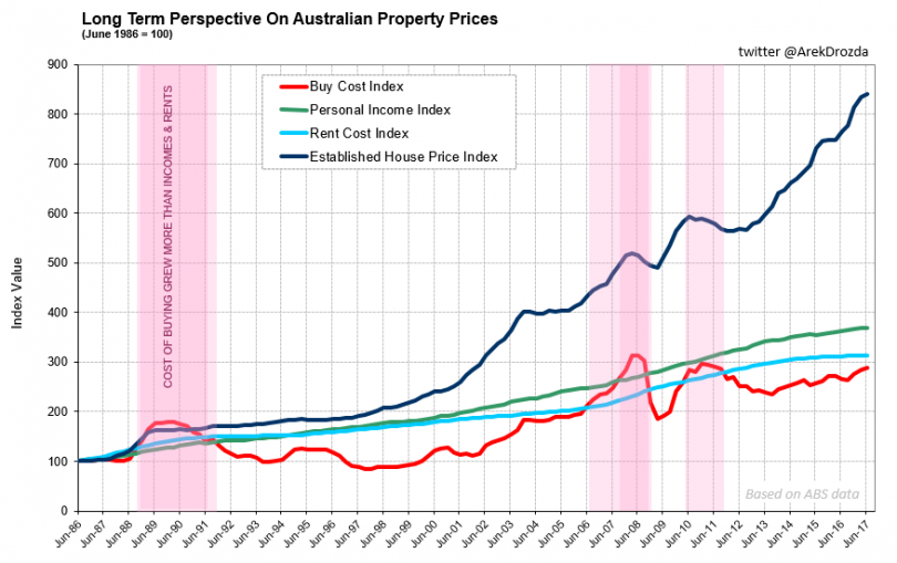
Long term view – property prices Australia.

Long term view – property prices Canberra.
In a nutshell, market dynamics have not changed dramatically in three and a half years since my original analysis, so the anticipated outcome under the most probable mid-range growth scenario is still valid.
In particular, property prices in Australia increased just over 30% in that time (so, at a slightly faster pace than a mid-range growth scenario anticipating 60% increase in property prices over a decade). Since growth in incomes is over and above the rises in the cost of buying and the cost of renting, there is still plenty of room for further property price increases.
Please note, 1986 is as far back as the official house price statistics go but also happens to be a period almost unanimously accepted as the time when “things were cheap and balanced”. Hence, it can be appropriately used as a reference point.
All in all, working Australians can afford current property prices. In fact, we can afford to pay on average 28.5% more and still be under the historical affordability threshold.

Price growth potential Australia.
As it turns out, affordability is what really drives property prices in Australia, not exuberant property investors or cashed up foreigners. But you will never have inferred that following only populist opinions.
The potential for price growth in Canberra is even more substantial since local price rises have been subdued in comparison to the national averages.
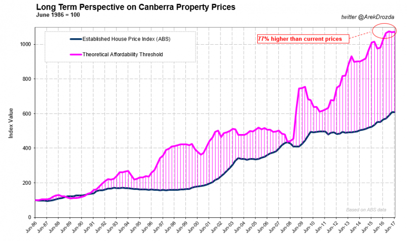
Price growth potential Canberra.
Concluding, the charts above demonstrate the capacity for property prices to increase much, much further – if it happens, it would be to the total astonishment of the masses and a loud outcry of commentators professing the property price bubble in Australia.
Next week we will examine if there is still a fertile environment for prices to continue growing and if there are any visible clouds on the horizon that may suppress that growth.
Does this information change your perception on what is happening in the Australian property market or are you still sceptical as to its merit? Would your decision whether to buy or rent property in the last three to four years be different if you had this information on hand in the past?


