4 December 2013

CBR, Canberra's city brand unveiled

| Advertising Feature
Join the conversation
79
brand canberra cbr

In September 2012, the ACT Government began the development of a city brand for Canberra.

The city brand is designed to build on the success and momentum of our Centenary year and is a way for people to better understand and engage with Canberra as a place to live, work, visit, learn and invest.

Our sectors

Science, Research, Tourism, Environment, Region, History, Sport and Recreation, Food and wine, Embassies, Arts and Culture, Business, Education, Federal Government and ACT Government.

Our audiences

Local, regional, national and global.

Our values

Challenge, Ideas, Free Spirit, Quality of Life and Discovery.

Our personality

Genuine, Influential, Thoughtful, Contemporary and Collaborative.

Our brand essence

Brilliant Possibilities.

To read the full story behind the new city brand, please visit www.brandcanberra.com.au

The city brand is for all of Canberra not just the ACT Government.

It identifies Canberra’s unique qualities in a single, unified, “story telling” framework.

The essence of “Brilliant Possibilities” suggests Canberra’s potential future is bright but it will take action from each and every one of us to make it a reality.

It will be up to all of us as individuals, families, schools, universities’ and workplaces to make it a reality.

Have your say?

Today we begin a further three month community discussion about our new brand before the announcement of a final brand program in March 2014.

[First published Nov 28, 2013 @ 2:00]

Join the conversation

79
All Comments
  • All Comments
  • Website Comments
LatestOldest

Ben_Dover said :

Hey, looks like the same people got the contract for Santa!!

http://www.quietroom.co.uk/santa_brandbook/one

That is awesome! Love the venn diagrams, but most of it had me LOL! 🙂
Classic!

Ben_Dover said :

Hey, looks like the same people got the contract for Santa!!

http://www.quietroom.co.uk/santa_brandbook/one

Wow, that reads like a packet of cheap Chinese stationery!

As someone who was walked through the CBR brand book it does, actually look *exactly* like that.

Hey, looks like the same people got the contract for Santa!!

http://www.quietroom.co.uk/santa_brandbook/one

johnboy said :

Another take on it from Drum Media:

http://www.thedrum.com/opinion/2013/12/03/nice-one-canberra

Gods! That moronic “advertising speak” makes my brain bleed.

Looks a bit too much like the initial logo for Canberra Sand and Gravel ( CSG,, done funky style ). Might be copyrighted. !

ChrisinTurner said :

Why is it an “Art Deco” logo? Are we still back in the 1930’s? 3 months of consultation is supposed to have started but I couldn’t find it online anywhere. Should we use a quill pen and ink and write a letter to the Chief?

I’ve been to Napier in New Zealand, and let me tell you, calling this logo “Art Deco” is an insult to the style.

dannybear said :

As a young whippersnapper I know lots of people who travel from all over Australia to skate at Canberras skate parks, perhaps the goverment could print some of these logos onto skateboards and organize some sort of giveaway or skate competition? And water bottles to hand out during the summer could be good too.
Maybe even some bottles of wine so the wrinklies don’t feel left out 😀

There is already the Centenary Shiraz, Riesling and Sparkling, which all have pretty good labels… I’m glad they didn’t bugger them up with this logo.

As a young whippersnapper I know lots of people who travel from all over Australia to skate at Canberras skate parks, perhaps the goverment could print some of these logos onto skateboards and organize some sort of giveaway or skate competition? And water bottles to hand out during the summer could be good too.
Maybe even some bottles of wine so the wrinklies don’t feel left out 😀

Holden Caulfield said :

So you use the cultural connection (ie. flag colours) to support Ikea’s colour scheme, but change your position by 180° to trash similar reasoning for colour use in the Canberra Brand.

You’re on fire. I can’t wait to see what you come up with next.

Are you saying the Swedish flag is anachronistic?

Anyway moot point, while they’ve put the awful yellow version up front, it looks like there’s a dozen different versions of the CBR logo already including a couple where the ‘CBR’ are filled with patterns. Overall the result is very messy. Brands should be stable and consistent across different mediums and uses. A couple of colour versions and a couple of monochromatic versions tops. Having so many versions just waters it down.

The day people realise that a brand is not a logo, the better.

What is a brand? Put simply, it’s the personal relationship or feeling about a product, service (or city) that someone has with that entity.

It’s certainly not a logo.

So to my colleagues out there in Adland, please don’t forget that, a brand is not what YOU say it is, it’s what THEY say it is.

Understand that and we might get somewhere.

Holden Caulfield11:16 am 29 Nov 13

miz said :

It all seems a bit tragic, embarrassing and ‘please like me’ for Canberra to have a ‘brand’. If Sydney launched a brand…

If?

It’s not tragic and it’s not embarrassing. It is very much “please like me” and is an effective method for cities to adopt when competing for tourist and business sector dollars.

Holden Caulfield11:11 am 29 Nov 13

c_c™ said :

You mean the anachronistic flag that features the out of date coat of arms. Gosh, forward thinking aren’t we.

Canberra’s floral emblem is the blue bell.
Canberra is the bush capital, surrounded by the place green tones of native bush.
Canberra is built on limestone plains and the dark soils in parts of the capital were once used by native peoples for artworks.

Plenty of inspiration around. About the only thing Canberra about this branding is the allusion to Griffin’s axis idea in the logo. Branding doesn’t even use the rather nice winning font and runner up in the official Centenary font competition.

So you use the cultural connection (ie. flag colours) to support Ikea’s colour scheme, but change your position by 180° to trash similar reasoning for colour use in the Canberra Brand.

You’re on fire. I can’t wait to see what you come up with next.

all seems a bit tragic, embarrassing and ‘please like me’ for Canberra to have a ‘brand’. If Sydney launched a brand, we Canberrans would scoff – and I would expect no less from others about this one. The govt has been scammed once again. They’re a bit thick, methinks.

If you go here:

http://en.parisinfo.com/ you can see the logo/brand for Paris
http://www.nycgo.com/ you can see the logo/brand for New York
http://www.visitlondon.com/ you can see the logo/brand for London

All seems a bit tragic, embarrassing and ‘please like me’

Gungahlin Al10:02 am 29 Nov 13

At least it will make for a nice short hashtag in winter: #CBRrrr

I like the idea of canberra having a brand identity & think its a great idea. Whether or not you like the logo, colours, amount of money committed to the initiative or whatever the great cities of the world have them either by design or accident.

What I like
– The video shows of some great images of Canberra

What I don’t like
– The people: monotonous tones, straight from an uninspired script. Reference to ‘future policy makers’ was a big turn off.
– The music: it’s great they’re using a local Canberra band, but it doesn’t really work. Nick Cave’s Red right hand makes a huge difference to the ‘Be Consumed’ Barossa campaign.
– The brand: well…having it shoved down my throat anyway. Flashing the logo a thousand times is not going to make me like it more (if I’m still watching).
– The length: Not sure how many will sit through 2:28 a second time. I imagine this will be trimmed for tv.
– Originality: Too many agencies trying to please too many people. It’s not exactly going to go viral…

c_c™ said :

dtc said :

DHL, Shell, Kodak, yellow pages, McDonalds, Ikea….all yellow

Ikea is Yellow on Blue for cultural reasons.

Shell and McDonalds both chose red and yellow because it’s recognisable on highways at speed from a distance.

DHL’s colour scheme is probably a mix of those two reasons.

Im pretty sure that you’ll find that Mcdonalds is yellow and red because those colours are known to enhance appetite, but also be irritating to sit around for too long..

Madam Cholet7:21 am 29 Nov 13

miz said :

It all seems a bit tragic, embarrassing and ‘please like me’ for Canberra to have a ‘brand’. If Sydney launched a brand, we Canberrans would scoff – and I would expect no less from others about this one. The govt has been scammed once again. They’re a bit thick, methinks.

Personally I relish the fact that Australians have a love-hate relationship with Canberra!

I agree with the ‘try hard’ assessment. I think that Canberrans in the main would agree that Canberra is already ‘grown up’ if you want to term it that way. I don’t see why we have to try and continue to justify ourselves to others out of our perceived embarrassment. And yes, most of us like the fact that not everyone wants to live here.

UsernameTaken2:59 am 29 Nov 13

At least the logo text wasn’t placed inside a circle …

Confident. Bold. Randy.

Sadly Brand Canberra isn’t getting me very excited…

ChrisinTurner said :

Why is it an “Art Deco” logo? Are we still back in the 1930’s? 3 months of consultation is supposed to have started but I couldn’t find it online anywhere. Should we use a quill pen and ink and write a letter to the Chief?

Oh well, you know, Hotel Kurrajong was such a success ‘n all with its focus on the 1930s …

maxblues said :

run2000 said :

It looks like yellow and black is a popular choice for capital cities at the moment. Here’s Wellington’s rebranding attempt:

http://www.stuff.co.nz/national/politics/9398807/Future-uncertain-for-new-Wellington-logo

Wellington’s budget was $40k, ours $2.6m, not sure either city got value for money.

I suspect the $2.6 million figure is the result of some sort of deliberate muddling between the Centenary budget and the everyday budget. Because this branding is undiluted Centenary branding – which presumably would have been paid for with whatever was left over after Robin Archer trousered her expenses.

It all seems a bit tragic, embarrassing and ‘please like me’ for Canberra to have a ‘brand’. If Sydney launched a brand, we Canberrans would scoff – and I would expect no less from others about this one. The govt has been scammed once again. They’re a bit thick, methinks.

Personally I relish the fact that Australians have a love-hate relationship with Canberra!

run2000 said :

It looks like yellow and black is a popular choice for capital cities at the moment. Here’s Wellington’s rebranding attempt:

http://www.stuff.co.nz/national/politics/9398807/Future-uncertain-for-new-Wellington-logo

Wellington’s budget was $40k, ours $2.6m, not sure either city got value for money.

I suppose If they did remove the right triangle the C would look like pac man eating the letters BR.

$2.6 million for this, Dare I say again more Labor waste AND NO TASTE WHAT SO EVER

Um the C looks like a reverse D

Holden Caulfield said :

c_c™ said :

Ikea is Yellow on Blue for cultural reasons.

You mean because it’s the colours of the Swedish flag, right.

Remind me, what is the main colour on the ACT flag?

You mean the anachronistic flag that features the out of date coat of arms. Gosh, forward thinking aren’t we.

Canberra’s floral emblem is the blue bell.
Canberra is the bush capital, surrounded by the place green tones of native bush.
Canberra is built on limestone plains and the dark soils in parts of the capital were once used by native peoples for artworks.

Plenty of inspiration around. About the only thing Canberra about this branding is the allusion to Griffin’s axis idea in the logo. Branding doesn’t even use the rather nice winning font and runner up in the official Centenary font competition.

dpm said :

…also, by the looks of advertising on RA today, i’d say some of the $ has gone their way!! All good!

There will be top hats and jewelled tie pins on the moderators!

They may even buy food.

Rawhide Kid Part35:53 pm 28 Nov 13

That was on my Air travel ticket. Has been for younks… And they think this deferent????

ChrisinTurner5:52 pm 28 Nov 13

Why is it an “Art Deco” logo? Are we still back in the 1930’s? 3 months of consultation is supposed to have started but I couldn’t find it online anywhere. Should we use a quill pen and ink and write a letter to the Chief?

Ronald_Coase5:32 pm 28 Nov 13

Our brand essence – Vanilla.

Our money – Pissed away on some dodgy PR stunt (with the exception of that given to RA).

…also, by the looks of advertising on RA today, i’d say some of the $ has gone their way!! All good!

poetix said :

The logo looks a bit wrapped up; a bit origami with a pinch of envelope. The C is a perfect reversed D, looking away from the other letters.

“Sydney looks nicer,” he remarked. “I shall post myself there.”

“BR!” exclaimed the other letters. “It is rather cold here.”

I don’t think that the place we live in enhanced by a brand, but I do hate all advertising.

Haha! The first thing I thought of was envelopes too! 🙂
Anyway, it’s harmless enough!

The city brand is designed to build on the success and momentum of our Centenary year and is a way for people to better understand and engage with Canberra as a place to live, work, visit, learn and invest.

Utter appaling clatrap. How does some banal squiggle make people “better understand and engage with Canberra as a place to live, work, visit, learn and invest”?

Does anyone in the real world really speak and think like these people?.Read their website, it’s the “Huh corporation” all over again

http://www.huhcorp.com/

Our main consulting strategy is to convince clients that we do stuff they can’t do themselves, and that we deserve lots of money for it. The best way to do this is to always look good, and always sound like we know something you don’t. Because we do.

Are you confused yet? Of course you are. And that’s just how we like it. Our marketing professionals are constantly coming up with new ways to make you feel inferior and stupid. Because you are. And we’re not. We’re new-age, eMoving, marketing consultants.

If you’re still not convinced, we’ll show you lots of marketing research and consulting cost analysis and global design positioning strategy reports to confuse you and hopefully convince you that we’re so knowledgeable you couldn’t possibly succeed without us. Because you can’t. So don’t even try.

Holden Caulfield3:48 pm 28 Nov 13

c_c™ said :

Ikea is Yellow on Blue for cultural reasons.

You mean because it’s the colours of the Swedish flag, right.

Remind me, what is the main colour on the ACT flag?

dtc said :

DHL, Shell, Kodak, yellow pages, McDonalds, Ikea….all yellow

Ikea is Yellow on Blue for cultural reasons.

Shell and McDonalds both chose red and yellow because it’s recognisable on highways at speed from a distance.

DHL’s colour scheme is probably a mix of those two reasons.

DHL, Shell, Kodak, yellow pages, McDonalds, Ikea….all yellow

People always criticise new logos – as mentioned, the CBA one was pilloried for several months when it was released.

The point of a logo is to make something identifiable instantly without needing to read it. The simpler the better – swoosh, big M etc. My main problem with this is that the ‘C’ doesnt look like a ‘C’ – needs to lose the inside triangle

Holden Caulfield3:03 pm 28 Nov 13

mossrocket said :

Whoa… a $2.6 million campaign?

That’s to be spread across a couple of years and will, presumably, include the advertising spend and so on across that time.

I like this place too, but that is truly dredging the depths of mediocrity in logo design.

How so? The logo is modern, adaptable as well as being short, snappy and memorable. Thankfully, it also avoids tired cliches. It seems to me like a good result for today’s usually short attention span.

c_c™ said :

Who vetted the colour scheme? Bright yellow is a negatively perceived colour in some cultures, signifying distrust and dishonesty. Comes across as very old fashioned too.

That’s probably why, when you see the logo applied in the video, a variety of colour schemes and variations are possible, meaning the logo is not as stuck in its ways as the majority of commentators here sharing their, erm, wisdom.

If you’re all such experts and could achieve the same aims over the same time period as the brief covers for a fraction of the cost and effort there’s nothing from stopping you starting your own business.

Spend five minutes making a better logo with supporting documentation, charge thousands and kick up your heels. Simple! Go on, I dare you…

the.

video.

is.

toooooo.

long.

and.

busy.

Can’t….

Be…

Rooted…

c_c™ said :

Who vetted the colour scheme? Bright yellow is a negatively perceived colour in some cultures, signifying distrust and dishonesty. Comes across as very old fashioned too.

lol – so how do you like the RiotACT colour scheme?

[Yet] another example of the rubbish advice governments get from advertisers/marketers/brand managers. These half-wits, sorry, quarter-wits, should be banned from doing business with all levels of government.

That was MY money! MINE! And you wasted it on this trash. This airport destination code, this ABBREVIATION, is given ‘flagship’ words ‘Confident’ ‘Bold’ and ‘Ready’. (Don’t even get into the psychological argument that someone who feels that they need to declare that they are confident and ready is doing it because they have low self-esteem and are insecure because they are not confident or ready, or are anxious about people perceiving them as not confident or ready.)

I’ve got oodles of abbreviations and acronyms for these clowns.

Who vetted the colour scheme? Bright yellow is a negatively perceived colour in some cultures, signifying distrust and dishonesty. Comes across as very old fashioned too.

Even though looking cheap, the logo has been expensive, so what we need is a sponsor for the logo.
Canberra has had to look to Asia for sponsors because of our minimal industrial profile (eg Raiders/Huawei) and as one of our sister cities is in Japan.. how about HONDA CBR. Honda Motorcycles make several models tagged with CBR and think of the photo op of Gallagher, Barr and Corbell cruising Northbourne on motorbikes.

MERC600 said :

I’m with Oy Vegas on this. Why not use the skywhale in the logo.

CBR; A bunch of tits full of hot air!

That’d work.

What a bunch of @rse.

Bring back “Feel The Power of Canberra.”

It looks like yellow and black is a popular choice for capital cities at the moment. Here’s Wellington’s rebranding attempt:

http://www.stuff.co.nz/national/politics/9398807/Future-uncertain-for-new-Wellington-logo

HiddenDragon12:38 pm 28 Nov 13

Geoffrey Tory meets tangrams – how apt for a city which has periodic Parisian pretensions and serves, in a fashion, as the political capital of a nation which is so economicaly dependent upon the Middle Kingdom. Absent the “Canberra” below the stylised CBR, people outside our fair city might think it’s actually “GBR” – perhaps the logo for some festival or sporting event being held by a city in northern England which is still trying to recover from Thatcherism – a grimly appropriate comparison.

The “B” might suggest a backside, viewed from a particular angle – which could give a subliminal boost to tourism.

Oy_Vegas said :

Like the logo. Colour is meh. Overall, needs more Skywhale.

I’m with Oy Vegas on this. Why not use the skywhale in the logo. It’s known all over the country, I think. ( has it made it to WA yet )

Whoa… a $2.6 million campaign?

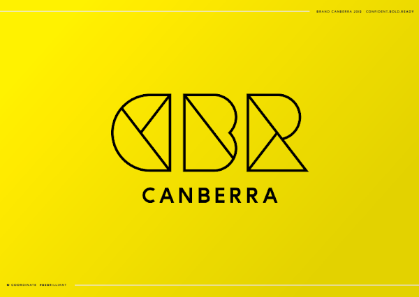
The campaign includes a new Canberra logo to represent the capital city, with the letters ‘CBR’ standing for ‘Confident, Bold and Ready’.

There’ should be some change left over…
We can get a pod of Skywhales now!

It reminds me of the Jamie Oliver Brand Guide…
which is an internal document – it’s weird that Brand Canberra is public…

Here’s some choice Jamie Oliver Brand Guidelines tidbits:

REFLECTING JAMIE
Jamie Oliver the man is fundamental to our brand. Our identity is therefore a true re?ection of Jamie, creating an iconic brand that captures the essence of who he is and what he stands for now and in the future.

The things that are important to Jamie are in turn important to us:

Jamie the person
making it easy, anyone can, inspiring

Jamie the brand
simplicity, ease, practicality, inclusive, informal, universal, inspiration, energy, creativity.

PREMIUM: TONE OF VOICE

Our tone of voice is purposeful passion. It is about bringing meaning and credibility to all that we say. It helps us make sure that our words are not only ?lled with Jamie’s easy warmth, but also have a resounding reason to be there.

Copy should always be a balance between purpose and passion, sharing knowledge and opinions in a truly engaging way that resonates with all people.

We achieve this by using straight-talking and energetic language.

Gungahlin Al said :

So we are to be defined by our airport code?
I am yet to be convinced…

I already use CBR as shorthand for Canberra. I can’t be the only one.

How to stop people referring to Canberra as “CBR” – tell them it stands for “Confident, Bold, Ready”.

Masquara said :

Branding that requires people to read the pitch is an immediate, unsalvageable fail, Melons!

Ugh. Like those ads where you’re supposed to “shazam for more info” – wtf? If I like a song, I’ll use Shazam. If I want to know about a product I’ll use Google and include the word “review” or “criticism” to see where it might fail.

The Crimes reports that advertising agency, Coordinate, “came up with the CBR logo – standing for Confident. Bold. Ready. And alluding to the abbreviation for Canberra on boarding passes and Twitter hashtags, giving it an international flavour.”

So, not:
Chaotic Bloody Roads
Can’t Be Rooted
Come and Be Retrentched
?

The lines refer to the architectural drawings of Walter Burley Griffin and Marion Mahony Griffin.”

Riiiiiiiiiiiiiiiiiight.

CBR, CANBERRA BRANDING RORT?

I like it. I like living here. Canberra has a lot to offer and that of course includes people who want to bash any attempt to increase our national and international profile. Sure I think the logo looks like something from a 90’s nightclub but everything old is always new again at some stage.
If you don’t like Canberra, the landscape, the people or anything else then of course you can exercise your right to live somewhere else 🙂

Gungahlin Al10:58 am 28 Nov 13

So we are to be defined by our airport code?
I am yet to be convinced…

Does anybody else find these silly logos to be a turnoff? I can’t stand that Melbourne book logo we see on all the sporting events, this one looks amateurish and rushed. At least it isn’t as bad as that ridiculous burger logo the former Labor government in Qld inflicted on the state.

The logo looks a bit wrapped up; a bit origami with a pinch of envelope. The C is a perfect reversed D, looking away from the other letters.

“Sydney looks nicer,” he remarked. “I shall post myself there.”

“BR!” exclaimed the other letters. “It is rather cold here.”

I don’t think that the place we live in enhanced by a brand, but I do hate all advertising.

Fkn ugly, full of BS buzzwords, and a waste of ACT ratepayers money to boot. What a wank!

Holden Caulfield10:06 am 28 Nov 13

astrojax said :

how is ‘challenge’ a value?

See, you’ve embraced it already!

Holden Caulfield10:03 am 28 Nov 13

NoniDoll said :

That logo will be out of style in three to five years, and is hella ugly. The geometric style reeks of ‘fad’.

Not necessarily. Yes, the design is fashionable to a degree, but the simple geometric nature lends itself to a broad range of treatments that will give it a longer life than one may first think. The video alone shows how versatile the “CBR” lettering can be.

People thought the Commonwealth Bank logo was pants too. It still looks pretty fresh and current today. It must be 20 years old now.

The timing, off the back of Canberra 100, is good for Brand Canberra and now is the time to build on that momentum.

I’m not sure the city will ever be able to shake the nation’s thirst for Canberra-bashing but I’m pleased to see GovCo is having a go.

Like the logo. Colour is meh. Overall, needs more Skywhale.

Feel the power…

Hey, I liked Feel the Power!

Whilst I appreciate the value of a good city brand (the ‘I Amsterdam’ brand/program impressed when I was in Europe), this opening salvo of buzzwords and a trendy logo seems like a poor way to get locals on-board.

Masquara said :

Why are we using the Snows’ airport code as our branding?

It may be Snow’s airport, but it’s not his code. CBR is the IATA code for Canberra. If you’re an airport train spotter, the ICAO code is YSCB.

Oh… f*cking… dear….

Feel the power…

Every time I see one of those numberplates I feel sorry for the person driving the car 😀

CanberraMelon said :

Please visit http://www.brandcanberra.com.au to read the story about Canberra’s new brand. Thanks.

Branding that requires people to read the pitch is an immediate, unsalvageable fail, Melons!

Holden Caulfield9:15 am 28 Nov 13

Well the public commentary is going about as well as I would expect, haha.

CanberraMelon8:51 am 28 Nov 13

Please visit http://www.brandcanberra.com.au to read the story about Canberra’s new brand. Thanks.

That logo will be out of style in three to five years, and is hella ugly. The geometric style reeks of ‘fad’.

It makes me sad.

The city brand is designed to build on the success and momentum of our Centenary year and is a way for people to better understand and engage with Canberra as a place to live, work, visit, learn and invest.

No matter what fancy colours, words and ideas you spend money developing, people are still aren’t going to come here. It’s not like someone sitting in their Condo in Sydney, Melbourne etc are going to see a yellow rectangle with some lines on it and say “hot damn, that makes itch to go and see those Canberra folk because they value free spirit and ideas and stuff…”

The essence of “Brilliant Possibilities” suggests Canberra’s potential future is bright but it will take action from each and every one of us to make it a reality.

The future probably isn’t so bright if you’ve been made redundant from a Government department recently, or were trying to start a career with them in the next 3 years. But don’t worry, a nice bright yellow logo will make you forget all your worries!

Obviously a huge problem for Canberra is that our city’s brand is constantly defined by others.
These others aren’t concerned with all the beautiful things people can and do do here and instead the winning views come from the news declaring ‘Canberra to introduce tax’ to the tired and outdated gags about fireworks and porn. For fuck’s sake, people in Sydney are mocking us for having planned our traffic flow.

I think this is a great step in wresting back our own identity and injecting some truth for all of our reputations. I look forward to seeing this across the genuinely organic and interesting things about town like You Are Here and I hope it is never hijacked by dull things like the Canberra Centre.

I’m on board.

“Brilliant possibilities” sounds like sarcasm.

Is it using our new Centenary font?

Why are we using the Snows’ airport code as our branding?

How is the centenary relevant as ongoing branding?

Most of all – why the colour, which is so incredibly unflattering to any but the darkest complexion as a tee-shirt? This is an almost fluoro yellow. Not fit for purpose.

How much was spent on consultation, just to have some idiot executive say “I like the National Gallery logo, make it just like that!”?

how is ‘challenge’ a value?

Daily Digest

Want the best Canberra news delivered daily? Every day we package the most popular Riotact stories and send them straight to your inbox. Sign-up now for trusted local news that will never be behind a paywall.

By submitting your email address you are agreeing to Region Group's terms and conditions and privacy policy.