Kim Huynh considers whether the staleness and monotony of our signs says something about our politics.
So many signs! So many signs!
The increased number of candidates in the upcoming ACT election (141 all up!) seems to have made for a far greater number of political signs than ever before.
Or it could be that riding the streets campaigning for three or so hours a day has made me particularly attuned to their presence?
There’s certainly been a lot of media coverage of the signs, much of it critical.
My one-time boss John Warhurst pointed to an incensed resident who pledged to avoid any candidate who committed ‘visual pollution’ in this way.
The extended commentary on a case of sign vandalism in the RiotACT was largely unsympathetic to the candidate, and at times nasty. This suggests to me that many people view political signs – and politics more generally – as getting in the way of our lives rather than making them better.
Independent David Pollard commented that he would prefer to go down the Yass path and only allow election signs on private land, which would be good for the environment and somewhat reduce the advertising advantage of the major parties.
Here’s my two cents on what these signs say and how we can interpret them to make our commutes and indeed the democratic process a little more informative and enjoyable.
The science of election signs
When it comes to getting votes, signs by themselves are just about useless.
They can only be effective as part of an integrated strategy; that is, they should reinforce a message from someone or some group whom you already know through personal contact, via the media or by reputation.
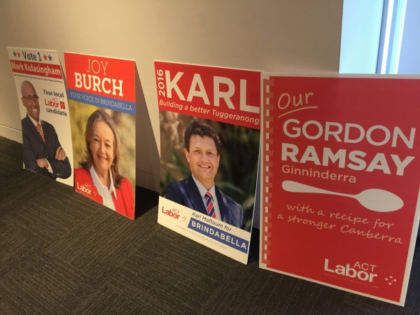
ALP signs tend to focus on name recognition. Ultimately, that’s all that voters have to go by on the ballot paper. So the most recognizable half of a candidate’s name is often emboldened and repeated: Tara, Tara, Tara, Tara.
The obvious strategy for Gordon Ramsay in Ginninderra was to play off his culinary namesake (I reckon there’s a fair chance someone named ‘Nigella’ will run in 2020).
This year there’s no Julia Gillard for Guilia to bounce her ‘G’ off. But the fact that she’s not using her face on her signs like last time, but rather concentrating on ‘Giulia Jones’ suggests that it’s still all about the name at this stage of the season.
Being in opposition, many Liberals tend to go negative when it comes to their signs, highlighting hot button issues with red news flash type banners, ‘No Trams’.
Their placement of signs is also instructive, especially with regard to Jeremy Hanson. Identical signs are positioned at accurate distances apart to suggest an even temperament, military discipline and a safe pair of hands. I wonder whether he staked them in himself.
The ALP takes what I like to think of as a Floriade approach to sign placement. There’s a couple of signs with the candidate’s picture standing tall like tulips among a bunch of squat unicolour pansy-like signs emblazoned with a name. It’s important for a fifteen-year-old government to remind us that it’s still blooming.
Independents (including and especially me) can struggle to get their signs right due to a lack of experience and resources. Over eagerness can lead to placing too much information on signs, all of which is likely to be ignored.
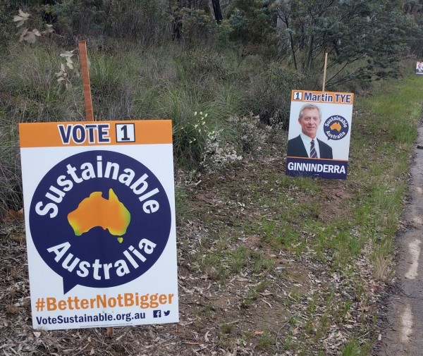
Sustainable Australia’s sign is centered around a striking image of the country that looks like it’s almost overheating, but there’s a few too many words to drive by and digest with ‘Vote 1’ along with their hashtag and website.
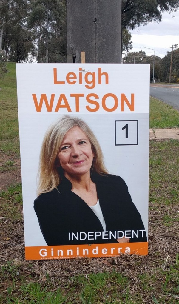
Independent Leigh Watson has done well by standing slightly askew so as to demonstrate depth and dynamism (as opposed to the standard grinning mug shot). Her no nonsense crossed arms are offset by a friendly visage.
The art of election signs
Election signs are never going to be high-brow or enlightening, but they need not treat us like Pavlov’s dogs. How then can they be more authentic, intriguing and cool?
I propose that that we put less emphasis on the science of election signs and inject them with a little personality and artistic flair.
Instead of resorting to well-used templates, candidates should be encouraged to design their own signs.
Slogans should be rejected in favour of punchy and evocative poetry. This may be asking too much, but surely the slogans can be punchier and more poetic: Kevin 07, Doszpot in First Spot.
Candidates could also try coming up with their own logos. If one logo really works for them, why not get it tattooed on some part of their body? And let’s consider moving away from using faces that are bland, horribly touched up and which so often obscure rather than reveal the true person.
It would be good to see election signs that leave some room open for interpretation. They might be playful, challenging or perhaps raise the occasional WTF?
The staleness and monotony of our signs surely says something about our politics.
I don’t pretend to have mastered the science or art of election signs, but this is the outcome of my knowledge and experience of them to date. Needless to say, my Mum hates it.
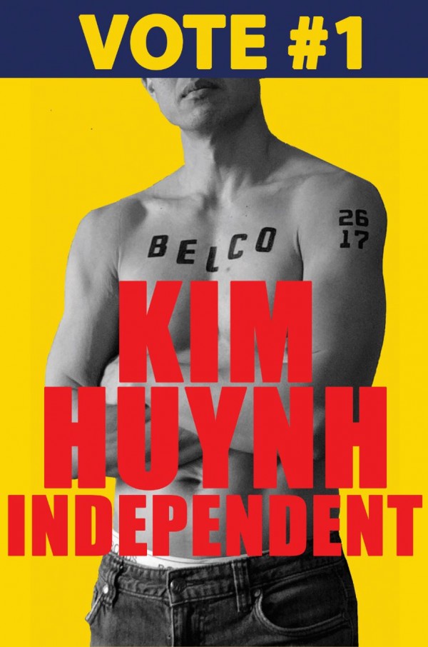
How would you go about improving the quality of election signs and politics in general? Do you favour banning or restriction signs? If so, what would you have instead?
Kim Huynh, Independent Candidate for Ginninderra. Check him out at GoKimbo.com.au or on Facebook.


