I’ve got a nasty head cold at the moment. But I felt my life was still lacking in pain. So yesterday I went and had a poke around all the political party websites to see what they had to offer and what they said about the eight parties vying for our votes next month.
In past elections where we’ve done this we’ve paid a lot of attention to hosting arrangements, software used to host the sites, and disability access.
But automated disability access checkers are no longer free, and the software the disabled use has become much better at handling carelessly constructed websites. Also in this era of virtualised hosting the exact arrangements say less than they used to.
So this time I’ve just looked at general aesthetics and usability. Knock yourselves out in the comments explaining how and why I’m wrong.
Parties appear in the order in which they are listed on the register of political parties.
Australian Labor Party (ACT Branch)
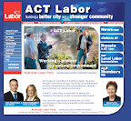
It’s attractive, and well laid out. The policy area is sadly a single huge Megabyte of pdf, so it’s there, but who’s going to read that?.
The newsroom is a bit light, mostly being links to other pages such as the Chief Minister’s Departmental page.
The TV page is still waiting for content, and the radio page has one ad.
Good layout and candidate information compensates.
Four stars.
—
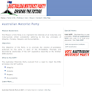
It’s a clean and effective layout. But the site could do with more images, or any images at all other than just their logo.
Policies are a little light, And tumbleweeds are blowing through the through the newsroom.
Three stars
—
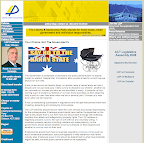
The LDP has lots and lots of ideas. As you’d expect after a whole wing of political philosophy is crammed down to a lone minor party.
The website has only one candidate named and no mention of which electorate he’s contesting.
The press releases link is not working in Safari.
Two and a half stars.
—
Liberal Party of Australia (A.C.T. Division)

It’s got a big Z on it. And two pictures of big Zed depending where you’re at in the slideshow.
Black and white photography seems to be a big campaign theme of the Canberra Liberals on top of their blue and gold colours looking rather regal. It’s not entirely clear why the huge purple buttons were required.
Liberal TV has fourteen videos available for those who have tired of life.
There’s no consolidated newsroom. Which means visitors need to know that Vicki Dunne makes statements on the environment. Perhaps they’re assuming a little too much knowledge there? To be fair the front page does have the most recent news on it.
Policies are at least laid out to make it easy to find them.
Three and a half stars.
—

It’s… grey…
With very big headlines.
The newsroom, however is functional, albeit in very, very, large type with some whitespace irregularities.
The whole site needs more photographs. And there are some obvious typos and spelling errors leaping out.
Apparently they’re only running in Molonglo. Or at least that’s the impression the website gives.
Three stars.
—
Richard Mulcahy Canberra Party

The old http://www.richardmulcahy.com.au/ appears to have been hauled down which is a shame because it was a bit of a landmark as the ugliest website in the world. Based around netscape grade tables and with canary yellow everywhere. A 2007 view of an earlier horror has been maintained by the Internet Archive.
That excitement has been replaced with a postcard on the new site which eventually leads to a website.
That site sports a sad little menu item saying that a whole 628 visitors have been in since 5 August. We can only hope it bears up to the streams of curious rioters.
There’s no actual mention of which candidates are standing for which electorate.
The site does have a good looking newsroom, but it’s lacking updates since 15 August.
Three stars.
—

Purty. Green.
Menu items on the top and right leaving new content on the left. i.e. Thoughtfully intended to service regular visitors.
Candidates are heavily promoted, including which electorate they’re representing.
The newsroom is a bit light and apparently East Gippsland logging is a major issue for them at this upcoming ACT election. (Act local people, act local).
Four and a half stars.
—
The Community Alliance Party (ACT)

Busy! With mixed fonts.
And a series of testimonials from un-named people. Hmmm…
Candidates are well laid out by electorate, even if Norvan’s photograph makes him look like he has downs syndrome (I’m reasonably sure he doesn’t).
Policies are so voluminous as to beggar belief.
Four stars.
—
Candidates aren’t finalised until 24 September so at that time we’ll go back and see what web-presences they’ve whipped up for themselves.
[Disclosure: The ALP and LDP are, at the time of writing, advertisers with RiotACT.]


